
在前一篇文章中,我們用了新擬物化設計風格 (neumorphic design principle),搭配 Michal Malewicz 的文章 Neumorphism in user interfaces 中所用的調色板,構建了一個音樂播放器。
你可以參閱這個連結,來閱讀完整教學和看看當時所用的顏色。
在這篇文章中,我們會一起在 SwiftUI 中,實作一個屬於你的新擬物化設計風格切換按鈕,並為切換視圖製作動畫。
在開始之前,請先把新擬物化顏色添加到 Asset,並為 3 種顏色建立一個結構 (struct)。
struct Colors {
public static let mainColor = "mainColor"
public static let lightShadow = "lightShadow"
public static let darkShadow = "darkShadow"
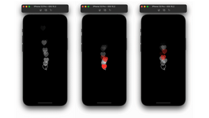
}凹視圖 (Concave View)
首先,讓我們創建一個凹視圖。我們會利用圓角矩形作為切換按鈕 (toggle) 視圖的形狀,並以 shadow(color, radius, x, y) 修飾符來創建內面的陰影:
- color:使用
.fill()修飾符。 - Radius:使用 blur 修飾符。
- x 和 y:使用 offset 修飾符。
因為我們想突出矩形的圓角,所以會用另一個圓角矩形作遮罩 (mask)。我們可以參考以下的程式碼,來創建一個淺 (shallow) 的凹視圖。我們可以為 roundedRectangle 的 cornerRadius 創建一個變數,從客製化的切換按鈕視圖傳遞cornerRadius,來提高視圖客製化的彈性 。
淺的凹視圖:
struct ShallowConcaveView : View  {
    let cornerRadius : CGFloat

    var body: some View {
        ZStack {
            RoundedRectangle(cornerRadius: cornerRadius)
                .fill(Color(Colors.mainColor))
            RoundedRectangle(cornerRadius: cornerRadius)
                .stroke(Color(Colors.darkShadow), lineWidth: 2)
                .blur(radius: 0.5)
                .offset(x: 1, y: 0.5)
                .mask(RoundedRectangle(cornerRadius: cornerRadius).fill(LinearGradient(colors: [Color(Colors.darkShadow), Color.clear], startPoint: .top, endPoint: .bottom)))
            RoundedRectangle(cornerRadius: cornerRadius)
                .stroke(Color(Colors.lightShadow), lineWidth: 2)
                .blur(radius: 0.5)
                .offset(x: -1, y: -1.5)
                .mask(RoundedRectangle(cornerRadius: cornerRadius).fill(LinearGradient(colors: [Color.clear, Color(Colors.lightShadow)], startPoint: .top, endPoint: .bottom)))
        }
    }
}
如果我們想要實作一個深的凹視圖,可以再添加兩個圓角矩形,並把 offset 數值增加,比前面淺陰影的 offset 更大。
深的凹視圖:
struct DeepConcaveView : View  {
    let cornerRadius : CGFloat

    var body: some View {
        ZStack {
            RoundedRectangle(cornerRadius: cornerRadius)
                .fill(Color(Colors.mainColor))
            RoundedRectangle(cornerRadius: cornerRadius)
                .stroke(Color(Colors.darkShadow), lineWidth: 2)
                .blur(radius: 0.5)
                .offset(x: 1, y: 1)
                .mask(RoundedRectangle(cornerRadius: cornerRadius).fill(LinearGradient(colors:[Color(Colors.darkShadow), Color.clear], startPoint: .top, endPoint: .bottom)))
            RoundedRectangle(cornerRadius: cornerRadius)
                .stroke(Color(Colors.darkShadow), lineWidth: 6)
                .blur(radius: 3)
                .offset(x: 3, y: 3)
                .mask(RoundedRectangle(cornerRadius: cornerRadius).fill(LinearGradient(colors: [Color(Colors.darkShadow), Color.clear], startPoint: .top, endPoint: .bottom)))
            RoundedRectangle(cornerRadius: cornerRadius)
                .stroke(Color(Colors.lightShadow), lineWidth: 2)
                .blur(radius: 0.5)
                .offset(x: -1, y: -1)
                .mask(RoundedRectangle(cornerRadius: cornerRadius).fill(LinearGradient(colors: [Color.clear, Color(Colors.lightShadow)], startPoint: .top, endPoint: .bottom)))
            RoundedRectangle(cornerRadius: cornerRadius)
                .stroke(Color(Colors.lightShadow), lineWidth: 6)
                .blur(radius: 3)
                .offset(x: -3, y: -3)
                .mask(RoundedRectangle(cornerRadius: cornerRadius).fill(LinearGradient(colors: [Color.clear, Color(Colors.lightShadow)], startPoint: .top, endPoint: .bottom)))
        }
    }
}
客製化切換按鈕動畫
在這個部分,我們會完成切換按鈕視圖,並為視圖製作動畫。首先,讓我們來設定會傳遞到 ContentView 的常數變數 (constant variable):
width:切換按鈕視圖的寬度height:切換按鈕視圖的高度toggleWidthOffset:切換按鈕的roundedRectangle的寬度cornerRadius:用來客製化所有圓角矩形的圓度 (roundness)padding:用來客製化切換按鈕與凹視圖的間距isToggled:用來將切換按鈕打開或關閉switchWidth:拉長或縮短按鈕,來製作打開或關閉按鈕的動畫
讓我們在 ZStack 中添加其中一個凹視圖,然後在 HStack 中添加 “on” 和 “off” 文本、或符號。
接著,讓我們來實作切換的開關。添加一個圓角矩形,把框架設置為等於或小於按鈕的高度,我們可以使用 onAppear 來設定 switchWidth 大小。然後,為圓角矩形添加陰影,讓開關凸出。
在 .onTapGesture() 中,把 isToggled 更改為相反的數值,並為 switchWidth 設置兩次動畫。在動畫中,開關會拉長及縮短,然後在第二個動畫結束時恢復原來的大小。
接下來,我們要添加一個由 isToggled 數值控制的 Spacer(),把開關向左或向右移動。最後,讓我們添加一個 animation( .spring) 到 roundedRectangle。
struct CustomToggle : View  {
    let width : CGFloat
    let height : CGFloat
    let toggleWidthOffset : CGFloat
    let cornerRadius : CGFloat
    let padding : CGFloat

    @State var isToggled = false
    @State var switchWidth : CGFloat = 0.0

    var body: some View {
        ZStack {

            DeepConcaveView(cornerRadius: cornerRadius)
                .frame(width: width, height: height)

            HStack {
                Text("ON")
                    .bold()
                    .foregroundColor(.green)

                Spacer()

                Text("OFF")
                    .bold()
                    .foregroundColor(.red)

            }
            .padding()
            .frame(width: width, height: height)

            HStack {
                if isToggled {
                    Spacer()
                }


                RoundedRectangle(cornerRadius: cornerRadius)
                    .padding(padding)
                    .frame(width: switchWidth + toggleWidthOffset, height: height)
                    .animation(.spring(response: 0.5), value: isToggled)
                    .foregroundColor(Color(Colors.mainColor))
                    .shadow(color: Color(Colors.lightShadow), radius: 2, x: -3, y: -3)
                    .shadow(color: Color(Colors.darkShadow), radius: 3, x: 3, y: 3)


                if !isToggled {
                    Spacer()

                }
            }

        }
        .frame(width: width, height: height)
        .onTapGesture {
            isToggled = !isToggled
            withAnimation(.easeInOut(duration: 0.2)) {
                switchWidth = width
            }
            withAnimation(.easeInOut(duration: 0.4)) {
                switchWidth = height
            }
        }
        .onAppear {
            switchWidth = height
        }

    }
}
ContentView
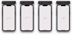
我們需要把背景顏色與切換按鈕視圖的主顏色相同,這樣才可以符合新擬物化設計風格的要求。填入自己想要的數值,來添加客製化的切換按鈕。讓我們看看不同數值的例子:
有間距的按鈕
struct ContentView: View {
    var body: some View {
        ZStack {
            Color(Colors.mainColor)
            CustomToggle(width: 170, height: 60, toggleWidthOffset: 20, cornerRadius: 30, padding: 10)
        }
    }
}
沒有間距的按鈕
struct ContentView: View {
    var body: some View {
        ZStack {
            Color(Colors.mainColor).ignoresSafeArea()
            CustomToggle(width: 150, height: 60, toggleWidthOffset: 20, cornerRadius: 30, padding: 0)
        }
    }
}
方型的按鈕
struct ContentView: View {
    var body: some View {
        ZStack {
            Color(Colors.mainColor).ignoresSafeArea()
            CustomToggle(width: 200, height: 80, toggleWidthOffset: 20, cornerRadius: 10, padding: 10)
        }
    }
}
ShallowConcaveView 的例子


謝謝你的閱讀。