

在 iOS 16,SwiftUI 引入了一個新視圖 Gauge,用來顯示進度。我們可以利用這個視圖,來顯示一定範圍內的數值。在這篇教學文章中,讓我們來看看如何使用 Gauge 視圖,以及如何使用不同的 Gauge 樣式。
Gauge 視圖是用來顯示當前數值在有限範圍中的水平,就像是汽車中的油量錶。開發者可以配置 Gauge 的顯示,例如是 Gauge 當前的數值、範圍、及描述其的用途的標籤。
- Apple 官方文件
Gauge 最簡單的使用方法是這樣的:
struct ContentView: View {
    @State private var progress = 0.5

    var body: some View {
        Gauge(value: progress) {
            Text("Upload Status")
        }
    }
}
在最基本的形式中,Gauge 的預設範圍是 0 到 1。如果我們將 value 參數設置為 0.5,SwiftUI 就會呈現一個進度條,指示任務已完成了 50%。

或者,我們也可以為 current value、minimum value 和 maximum value 設置標籤:
Gauge(value: progress) {
    Text("Upload Status")
} currentValueLabel: {
    Text(progress.formatted(.percent))
} minimumValueLabel: {
    Text(0.formatted(.percent))
} maximumValueLabel: {
    Text(100.formatted(.percent))
}
使用客製化範圍
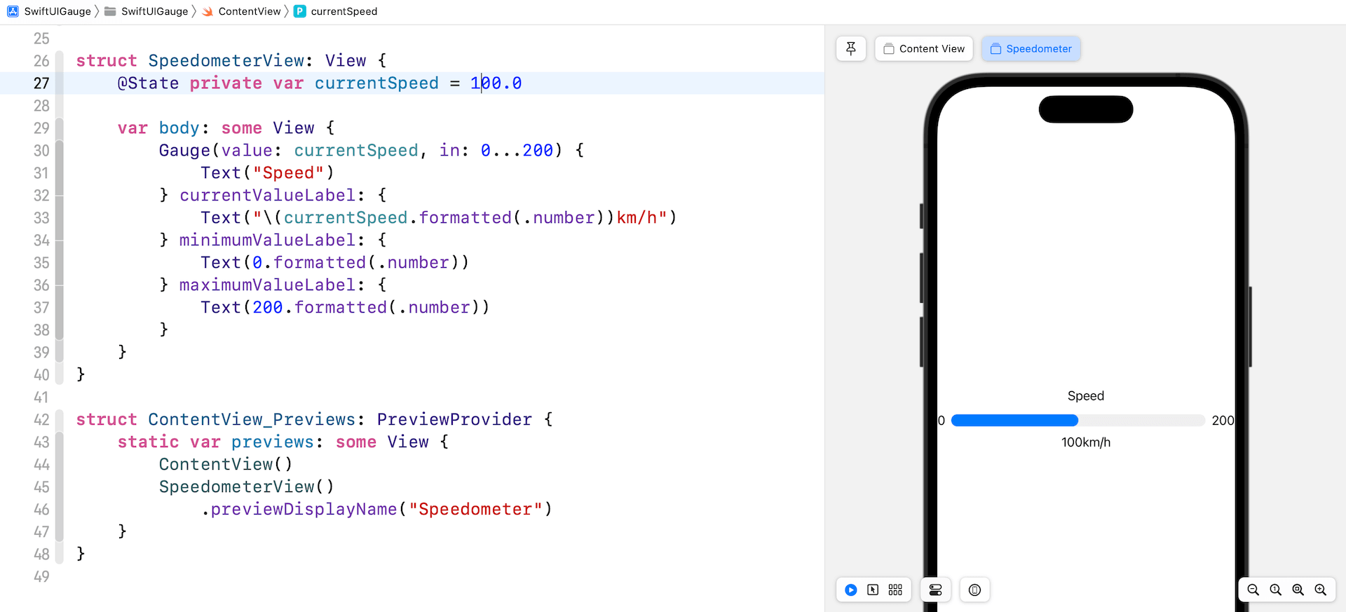
Gauge 的預設範圍是 0 到 1,也就是說,我們可以客製化想要的範圍。舉個例子,我們正在構建一個速度計,其最高速率為 200 公里每小時。我們可以在 in 參數中指定範圍:
struct SpeedometerView: View {
    @State private var currentSpeed = 100.0

    var body: some View {
        Gauge(value: currentSpeed, in: 0...200) {
            Text("Speed")
        } currentValueLabel: {
            Text("\(currentSpeed.formatted(.number))km/h")
        } minimumValueLabel: {
            Text(0.formatted(.number))
        } maximumValueLabel: {
            Text(200.formatted(.number))
        }
    }
}
在以上的程式碼中,我們設置範圍為 0...200,也在預覽結構中添加了 SpeedometerView。現在,如果我們把當前速度設置為 100 公里每小時,預覽應該會填滿進度條的一半。
使用 Image Labels
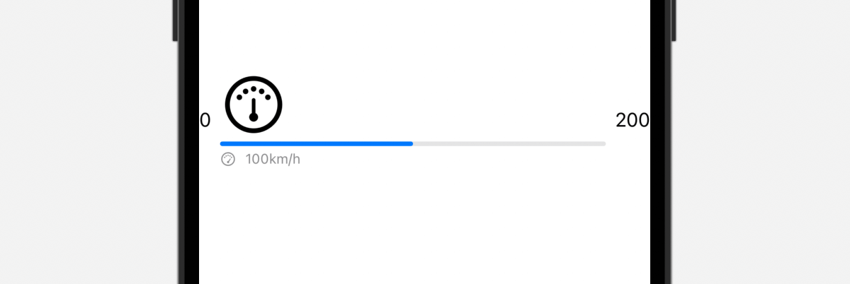
我們也可以使用 text label 來顯示範圍和當前數值。讓我們看看以下例子:
Gauge(value: currentSpeed, in: 0...200) {
    Image(systemName: "gauge.medium")
        .font(.system(size: 50.0))
} currentValueLabel: {
    HStack {
        Image(systemName: "gauge.high")
        Text("\(currentSpeed.formatted(.number))km/h")
    }
} minimumValueLabel: {
    Text(0.formatted(.number))
} maximumValueLabel: {
    Text(200.formatted(.number))
}
我們將 Gauge 的 text label 更改為系統圖像,並為當前數值的 label 創建一個堆疊 (stack),來排列圖像和文本。完成後,預覽應該會是這樣的:

客製化 Gauge 樣式

Gauge 視圖預設的顏色是藍色。要客製化 Gauge 視圖的顏色,我們可以附加 tint 修飾符,並設置想要的顏色:
Gauge(value: currentSpeed, in: 0...200) {
    Image(systemName: "gauge.medium")
        .font(.system(size: 50.0))
} currentValueLabel: {
    HStack {
        Image(systemName: "gauge.high")
        Text("\(currentSpeed.formatted(.number))km/h")
    }
} minimumValueLabel: {
    Text(0.formatted(.number))
} maximumValueLabel: {
    Text(200.formatted(.number))
}
.tint(.purple)
Gauge 視圖的外觀與 ProgressView 非常相似。我們也可以使用 gaugeStyle 修飾符來客製化 Gauge 視圖,這個修飾符支援多種內建樣式。
linearCapacity
這是預設的樣式,顯示從左到右填滿的進度條,就像上文的紫色進度條。
accessoryLinear
這個樣式會顯示一個進度條,當中有一個 point marker 指示當前數值。

accessoryLinearCapacity
這個樣式的 Gauge 會顯示一個比較幼的進度條。
accessoryCircular
這個樣式的 Gauge 不再是顯示一個進度條,而是一個開口環形 (open ring),當中有一個 point marker 指示當前數值。

accessoryCircularCapacity
這個樣式的 Gauge 會顯示一個閉口環形 (closed ring),以填滿的部分來反映當前數值,而當前數值也會在 Gauge 的中間顯示出來。

建立一個客製化的 Gauge 樣式

內建的 Gauge 樣式有限,但是我們可以利用 SwiftUI 來建立自己的 Gauge 樣式。讓我們看看一個簡單的範例,來建立上圖的 Gauge 樣式吧!
要建立一個客製化的 Gauge 樣式,我們需要採用 GaugeStyle 協定,並編寫自己的實作。以下是我們的客製化樣式的實作:
struct SpeedometerGaugeStyle: GaugeStyle {
    private var purpleGradient = LinearGradient(gradient: Gradient(colors: [ Color(red: 207/255, green: 150/255, blue: 207/255), Color(red: 107/255, green: 116/255, blue: 179/255) ]), startPoint: .trailing, endPoint: .leading)

    func makeBody(configuration: Configuration) -> some View {
        ZStack {

            Circle()
                .foregroundColor(Color(.systemGray6))

            Circle()
                .trim(from: 0, to: 0.75 * configuration.value)
                .stroke(purpleGradient, lineWidth: 20)
                .rotationEffect(.degrees(135))

            Circle()
                .trim(from: 0, to: 0.75)
                .stroke(Color.black, style: StrokeStyle(lineWidth: 10, lineCap: .butt, lineJoin: .round, dash: [1, 34], dashPhase: 0.0))
                .rotationEffect(.degrees(135))

            VStack {
                configuration.currentValueLabel
                    .font(.system(size: 80, weight: .bold, design: .rounded))
                    .foregroundColor(.gray)
                Text("KM/H")
                    .font(.system(.body, design: .rounded))
                    .bold()
                    .foregroundColor(.gray)
            }

        }
        .frame(width: 300, height: 300)

    }

}
為了遵從 GaugeStyle 協定,我們需要實作 makeBody 方法,來顯示我們自己的 Gauge 樣式。configuration 捆綁了 Gauge 的當前數值和數值的 label。在上面的程式碼中,我們使用了這兩個數值,來顯示當前速率,並計算弧形的長度。
我們實作好客製化的 Gauge 樣式後,就可以附加到 gaugeStyle 修飾符上來應用它。
struct CustomGaugeView: View {

    @State private var currentSpeed = 140.0

    var body: some View {
        Gauge(value: currentSpeed, in: 0...200) {
            Image(systemName: "gauge.medium")
                .font(.system(size: 50.0))
        } currentValueLabel: {
            Text("\(currentSpeed.formatted(.number))")

        }
        .gaugeStyle(SpeedometerGaugeStyle())

    }
}
我另外為這個範例建立了一個視圖。要預覽 CustomGaugeView,我們需要更新 ContentView_Previews 結構,並添加 CustomGaugeView:
struct ContentView_Previews: PreviewProvider {
    static var previews: some View {
        ContentView()
        SpeedometerView()
            .previewDisplayName("Speedometer")

        CustomGaugeView()
            .previewDisplayName("CustomGaugeView")
    }
}
更新好之後,預覽就會顯示客製化的 Gauge。
